Tuesday, June 30, 2009

Hi Tessa

I'm Yoli from MA3D. My project is a short narrative animation about ongoing conflict between brothers stuck in the same body (a two-headed character with two completely different temperaments).


I wanted to take an unusual approach to design and so researched the simple shapes and rich textures of 1950s cartoons. However, I'm unsure how to make the most of my simplistic setup (just the characters, an armchair and an abstract wallpaper shape) with lighting.


My plan is to create a straightforward three point light rig (your notes on Lies' project were really useful thankyou) as well as an ambient occlusion pass and potentially an incidence pass to act as an additional rim light.

It's also worth mentioning that I intend to tone down the background and armchair textures in comp as I'm concerned the scene may have become visually overcrowded (see below).

If there's any advice you could give me I'd really appreciate it.

Thanks

Yoli

Holly - RE: advice

Hi Tessa,

Thank you so much for advising me on the lighting and helping me to get the image that I'm aiming for - I've been finding it quite difficult to get this effect as I not sure about the methods, but I feel that you've given me a great springboard to get me going

I will look into each area that you have advised me on and work out how best to apply - oh I can't wait to get started on the lighting now -

Thank you also for your thoughts on composition and your amazing photoshopping - it's fab

Will post again once I have digested stuff and worked through things

Cheers,
Holly

Re 2 : Tessa's Advice

Hi Tessa,

Thanks for quick response. Now I got you and thanks for clearing it up. :)

RE: Kishore's project

Hi Kishore,

Thanks for replying to my advice, I will hopefully answer your questions :)
I am glad you already know how to use passes, that is useful to know for future posts.

When I wrote animate the light in comp I actually meant animate the colour and intensity not the motion of the light (that will teach me to be more specific :) ). The colour and intensity of your fill, rim and key light are probably going to change throughout the seasons for you to achieve the moods you want (and a nice smooth transition), this is what I was trying to demonstrate. I am glad you are planning on working in one scene and doing lots of comp work, I think this will get you the best results.

In the example I gave, I only rendered a sequence for the key light pass as I animated the position of the light in 3d (to save time I used a still camera and I only rendered 60 frames of the light moving up and then mirroring it so the light looks like it is moving up and down). Unfortunately in your project your camera is continually moving so you would have to render a sequence for all passes.

In fact lighting can be done in 2d (and therefore animated) but it would involve a complex relight lighting node (you might have to program it yourself) which uses the normals pass to simulate a light when you give it world space values for the light location.
If your interested you might want to try out a plugin for Nuke I found:
http://www.vfxtalk.com/forum/3d-relighting-plugins-nuke-t11037.html
My experience of using relight nodes is that they can give you inaccurate results (and I have never tried animating one) so I wouldn't recommend it but its useful to know it is out there as it may become more widely used in the future.

Hope my posts continue to be useful to the group. Look forward to seeing tests.

Tessa

Monday, June 29, 2009

NIGEL GORE - Architectural Visualisation

Hi Tessa,

My name is Nigel and I'm attempting to create a 3D representation of a ‘show-home’ interior concept from a proposed building development.

I am concentrating my efforts to fully complete one room within the building. The emphasis of my project will be on realistic, high quality images. I intend to manipulate the lighting in order to show how the same scene can be represented in different ways:
1. Daylight only
2. Daylight & Interior lighting
3. Interior lighting only (night scene)

I am planning to produce a 40 second track / pan animation.
Now that I am into the production stage of my project, it has become clear that I will have to reduce the length of the animated sequence or find an alternative way to present my work. This is due to the extremely high render times that I am currently experiencing to produce each frame.

I'm hoping that you will be able to give me some advice on the lighting that I have created so far as well as the most effective working method for me to adopt from this stage forward.

I've attached the animatic plus some images for you to assess...
I look forward to your response.

Cheers,

Nigel


ANIMATIC:


INITIAL LIGHT SET UP:

GLOBAL ILLUMINATION TESTS:
COLOUR PASS:

OCCLUSION PASS:

COLOUR PLUS OCCLUSION PASSES:

This is where I'm at right now. My next step will be to start to get the interior lights set up.
I am aware that the saturation needs to be adjusted on the pictures on the walls.

Re: Tessa's advice

Hi Tessa,

Thanks a lot for taking time and helping us. Your suggestions are really very useful. I have been going through your posts regarding my friends projects as well, they are very much informative.

I agree with your suggestion of working with passes. For the 2nd term project we rendered the whole sequence in number of passes - Diffuse, specular, reflection, Irradiance,AO etc. It gave a lot of control while compositing. We had few classes on compositing in Nuke so I am a little bit aquainted in working with these passes.

The example you've showed very informative, however I have a slight doubt. how can I animate the light in compisiting. Or did I get it wrong. will it be the light that will be animated in the scene itself.
I will do a small test as you suggested and will post soon.

meanwhile I am working on my moodboard as well, I however couldn't work on it for long. I am looking to put all things together in the scene and do one season with all the layers and the post work that you mentioned. I shall post an update in few days as the rest of my scene is all completed.

I have few more things going in my mind, perhaps I shud start a bit work on lighting and then ask, which I think would be more appropriate. :)

Thanks again

Kishore

RE: Holly's Pin-Up Project

Hi Holly,


This is a cute project! A great way of showing off your modeling and texturing skills.... but I think shading is going to be key to getting the look for this project. Everything is possible, that is why I love this job :) Time is your only constraint (and that means money too!)


The photo you have taken has flat (front on) lighting which is more like the music video, but the Elvgren designs have a bit more contrast in them with a clear bright light direction, and sharp but unusually warm shadows. If I were you I would take influence from different aspects of each.


The poster compositions are amazing so I would go with that style, and the skin looks soft and luminous almost like wax (look at incredibles pictures to see their subsurface scattering). The dark edges on the stockings you should be able to do with a shader by inverting the fresnel effect. Spend time working on your shaders, give yourself plenty of time, and start lighting early.


I prefer the Elvgren posters for their lighting, but the warm desaturated colours with hits of red and the flatness of the backgrounds works well in the music video. The lighting should be relatively simple for this scene, you will probably want the key light coming from the left, with a bit of fill and virtually no rim light. If you want the background to be flat, perhaps light it separately (on a new layer or in a new scene) with front on lighting. You might want to consider using a matte-painting for the background. You can build basic 3d models, place them in your scene and then instead of texturing, paint over them in photoshop. This is a valid and often cost effective way of working particularly when there is no camera move.


If you want, you could do quite a lot in post-production, to really make your image sparkle. Once you have gone as far as you can with the texturing, shading and lighting, take your renders into photoshop and do some paint work. Most magazine images are touched up so I don't see a problem doing it here. On your final render, render it big as if you were going to do a high quality print (this might be a nice idea).


It sounds like you have lots of ideas already, these your just my thoughts. I hope you don't mind but I took a few minutes to paint over and crop your photo to show you what I mean, and to give you ideas for lighting. My background lies in traditional painting and sometimes I find it helps to paint out your ideas on top of early renders. Its quicker than doing it in 3d and you can show the director a few different styles/colours quickly to help them make a decision if they are not sure what they want. I've seen art departments paint over renders too when they want to show the lighting artist explicitly what they want. Give painting a go yourself...it is a hassle free way of experimenting.


First I examined the composition, if you look at the Elvgren posters they cut off objects (similar to Degar paintings/sketches of dancers), it adds to the voyeuristic nature of the shot, and gives it an impromptu feel (although it is obviously staged!). Also I felt that because she is turning and looking to screen right, the composition was unbalanced, you feel she needs more space on the right to look into. A way around this was to bring the left side in, so that she is more central (but she doesn't feel like she is central), proportional to the whole there is now more space on the right. I have given the background sky a bit more context, with a horizon which helps frame the model and a vignette overall (brightness down and a touch of contrast) to draw your eye to her. I have changed the blue hue slightly so that it is warmer and happier, which is something you said you liked from your influences. I also painted out some of the clouds which overlapped with her, as I felt they were distracting from her shapes.


I kept going trying to match to the posters....I brought up the skin tones, making it brighter and more saturated, towards a redder hue. I also saturated the reds in her lips and her belt. I contrasted, brightened and saturated the skirt so it has a bit of interest. I have painted white over her top, keeping to the middle, so that she looks more directionally lit, but the edges stay dark. I also painted in a few shadows, and added edge shadow to accentuate her shapely body. Her stockings are transformed, and have that sheen you want, just by painting a bit of flesh colour (with a soft brush) over the top. Finally I desaturated the wood colours and foreground objects, to match the colours of the music video.


Now when you look at the image as a whole your eye is drawn to your model because she is framed (like your Elvgren designs), and with her brighter colouring she stands out from the background. I would definitely think about adding more objects in your composition, I like the suitcases. Remember they can be at the edge of the frame- cut off, if you can get something into that left corner(maybe aeroplane with banner?), it would fill the gap a bit. Maybe look at more Elvgren images to get ideas?


Hope this helps and is enough to get you started. Let me know how you get on.

Tessa


RE: Kishore's project

Hi Kishore


This is an inspired lighting project, your reference has a nice feel to it.  I agree with you completely, rendering in passes is a good way to go with this project.  You will have far more control getting your desired 'painterly' look using compositing.  Consequently it will need more planning, as this is a complex shot.  So far you win on the having the hardest lighting project :)


Are you planning on lighting 4 separate scenes, one for each season, with the same camera move and then blend between them in 2d... Or did you want to try to do more in 3d to cover the transitions?  My initial thought is that since we are quite far north on the planet, the Sun does not stay in the same place all year round, it gets to its lowest point in mid-winter and highest in mid-summer, you could use this motion in the key light to link the shots together.  It does mean there will be a constant movement in the lighting (shadows will move) which you might not like, but it might work better than fading between completely different light positions.


I found these time lapse videos, although not all smooth, they shows the changing light conditions, and vegetation, it might give you some ideas 

http://www.youtube.com/watch?v=Sdlc_92mDjs&feature=related


This one fades between photos, and I don't think it works as well....

http://www.youtube.com/watch?v=FGR0wP8XWwc&feature=related

http://www.youtube.com/watch?v=TemK6CF6lF0


You will definitely want to split up the house onto its own beauty layer, and then if you can, output separate reflections, diffuse (with shadows already multiplied),ambient and specular.  These will then add together in comp and should match exactly the beauty pass, if not, something went wrong.  The advantage of doing this is that over the timeline you will be able adjust each component individually and seamlessly between the 4 types of lighting.  For example, as the camera moves, you might find the reflection becomes distracting.... well you can animate that down in the comp over time.  I imagine you will also want to render the trees and grass on separate layers, and then also the sky.  


This might seem obvious but remember when using layers, render everything on black with alpha channels...it is the only way you will be able to composite correctly.  I am not sure how much you guys already know about compositing, but so that beginners can read this blog and learn from it I will presume it is new to you.


There is no 'correct' way of working on this project, as you start lighting you might realise that you need more control in 2d, and therefore need additional passes, or you might find it easier to work mostly in 3d.


If I were doing this project I wouldn't stick at just beauty passes.  This is definitely in the advanced category, so don't worry if you get lost at this next bit.  I don't expect anyone to do this, but I thought you guys might like to know a different style of working.  We used this technique on the feature film 'Happy Feet'


I would render a pass for each light, set as white lights, intensity 1.  Then I would colourize and add them together in comp.  If I use 3 lights, that will be at least 1 key pass with extra outputs for diffuse, and specular.  The other 2 lights might not have specular components.  I would need to render these 3 lights for each layer: the house, grass and trees.  This may seem like a lot of passes, and a lot of organisation, but I will only need to render one scene, once.  Then I would animate the lights in comp, so that we can get from one season to the next.   Winter would need slightly more work, as I would have to render the ground with snow, and different trees.  
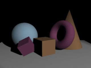


I knocked up a simple example for you.  I rendered one image for the fill light, rim light (both white light) and occlusion.  I then rendered a sequence for the key light.  Hopefully you can see the video?


I brought this into shake and animated the intensities and colour of the lights, and multiplied over the occlusion, also animating this effect in and out again.  Its a quick way of being able to tweak light colours to get the results you want without doing endless test renders.  It takes a bit of getting used to, but the benefits of lighting this way can be massive.  All in all it took be about 15 mins to put together this test, where as doing all the work in lighting would have taken me more than an hour.   On a film you can make lighting tweaks on shots without re-renders, shot turnaround can be very quick.  


Other passes you might need would be a beauty reflection (you might need raytracing for this depending on how you decide to do it) pass and lots of extra rgb matte passes, for tweaking objects in comp.


You will not be able to use subsurface scattering unless you have a way of using it only in the key light pass (you might want with snow) or any ambience/ambient colour in your shading for this technique.  The only way would be to take it out of the light passes, and render a separate pass for just those components.  Otherwise you will end up adding it over and over again.


Also using layers you would need to learn about dividing by the alpha channel before doing any colour corrections, and then post-mulitplying before using a 'merge'/'over'.  This is because you are colour correcting on black so on the edges and where there is transparency the colour will not be true (you might want to read up on this, or I can try and explain in more detail in a later post)


If you think you might want to try this way of working, I would recommend doing a test like the one I have produced first to see if it suits you (you could try a test using it as a mood board for your animation). With this technique you really need to have a clear idea in your head of what your doing or else it can get really confusing.


I am in danger of spending all day on this post, so I will stop here for now.

As always, ask away if there is anything you would like explaining in more detail.


Tessa

Friday, June 26, 2009

Holly's Pin-Up Project


Hi Tessa,

Just been reading your replies to Lies and Jamie - I'm totally clueless when it comes to lighting so I found them really helpful and they were easy to follow.

My project is a modeling a texturing project - I'm doing a 1950s pin-up and so am trying as much as possible to evoke that 50s feel (have taken lots of inspiration from Gil Elvgren). The top image is the design which I am working towards.

In regards to lighting I am torn between the style of Elvgren's paintings(images in the middle Stepping-Out and Bird's Eye View) and the style of the Candy Man video with Christina Aguilera (bottom images) . The things I like about Elvgren's paintings are the colours which to me seem saturated and matte - and the contours of the women which are usually darker than the rest of their bodies- I like the way her stockings look too (I would like to get a result like this for my model).

I like the style in candy man as I think it looks very bright and happy, which I think would suit my model and her bold colour sheme (red,white and blue).

It would be great to get your opinion on which style to aim for and how to achieve it (if it's possible?)

As for props and background I quite like the 'flat' look that they have in the design (not sure if I'm keeping the suitcases in the design) and I like the painterly feel of the sky

Hope I've explained myself okay, if you have any other suggestions for lighting styles then please let me know

Thank you and thanks for mentoring us

Holly

RE: Deli Team animation

Hi Gareth and Tony,


[Please read Final Gathering notes in RE: Jamie's project]


I like your idea, its a character animation project with clean lighting.  You have a nice little story there, quite an ambitious project!  Firstly I would suggest keeping your textures optimized (for memory reasons), so the right size for the object (seems obvious but I see massive maps for small background objects all the time), and don't go overboard with detailed textures, in can distract from the animation.


As this is a story piece, consider using lighting to enhance story points, perhaps a crack in the wall lets in a shaft of light which just happens to be lighting the prize winning ham :)  This would also add to the humor of the piece.  You can use lighting to hide, and reveal, with comedic timing.   Remember the set is the backdrop to story so keep it simple.  Think about the animation as a whole when lighting the environment.  I imagine a 1920's Delicatessen is quite dark at the back of the shop and looking towards the window it is really quite bright even on a dull day (when your in a dark room, your eyes similarly to film, would naturally overexpose a bright window).  It could be quite fun having characters coming through the front door silhouetted and glowing with rim light, again it could be used to enhance the comedy.  Sounds like you could do something cool with lots of red bounce light at the end when the shop is covered in tomato sauce.


If your project has a fair bit of facial animation you might want to start thinking about using light to accentuate your characters emotions.  For example to make a character look more scary,evil or conniving , add a light from below (it could be the bounce light off the worktop).  You can write these things into the script.  Get the animatic working and figure out where your light sources are in relation to the characters, and how you can use it to your advantage.  


I found some images in Pixar's 'The Incredibles' with a similar(ish) colour palette, as examples of adding interest and more importantly focus with lighting.  As you can see they are not really dramatic (apart from newspaper shot... this is actually a shock situation).  Having a dark surrounding with a bright light above really picks out the characters, who are the main focus.  They use light to draw us back to the characters time and time again.


An option you might want to try for this project is lighting for compositing.  So far no one has mentioned compositing in their proposal, but I think your missing a trick ignoring it.  I'll give some examples (of my industry experience) in another post as its too much to explain today.  Basically it would involve more planning, as you will need to render in layers, but you will have more control over the final look, and tweaks will be easy rather than heavy re-renders.  Personally I think it is more fun and more creative!


Hopefully this gives you something to think about, such an ambitious project is crying out for some special lighting.

Let me know your thoughts.


Tessa


RE: Jamie's Project!

Hi Jamie, [Deli team animation probably want to read this too]


Wow your concept art has real expression in it!   Great work! What are you going to do for the background?  a photo or a mattepainting?


I think image based lighting is a good idea, it is particularly useful for integrating CG into film/TV.  It is common practice to use an environment light as well as other lights.  I would normally use an env light as the fill light in my trio of initial lights but I would not use raytraced shadows, instead I would render out as a separate ambient occlusion pass and dial it in later in the comp [I'll give an example of this later].  From the what I know about image based lighting, it is quite hard to get an obvious light direction even when your map has one, as you said, you will probably end up with a evenly lit scene, this is why it is ideal as a base for your lighting, rather than being the only lighting.  You might want to photoshop your HDR image (once you have made it) as to remove the hot spots leaving a more 'fill' like map, and then on your env light turn off the specular component, as the fill light is generally a diffuse light source.  


Truthfully I am no expert in Final Gathering as I have only used it when matching to someone else's work (in lightwave, not in mental ray).   It gives 'nice' results, its a relatively quick way of working but it has its own issues, especially if you have any intension of using transparency and need continuity between frames :)  It works really well for showing off architecture, and from what I gather that is the main industry it is used in, as the only animation is normally a camera move, it is efficient to bake/save out the data and re-use it.   I have never used it in film (or had the option to), and only used it on one commercial and I have worked on quite a few.


Final Gathering (FG) is extremely computationally expensive, the more complex the model you have, the more detailed you want your render to be, the longer you have to wait for your test render. This leaves less time for actual lighting!  I believe this is partly why it is not used in film, the other factor being the lack of control the artist has.  Both ways you mentioned for using FG are valid, either using just an env sphere and changing the image or using coloured bounce boards or both.  Be careful adding extra lights though as it will quickly blow out, and depending on the number of bounces, adding a light will create more light overall (which gets bounced around) and you will loose your dark areas, ending up with a low contrast image.  Using it is an art form in itself, it involves tweaking a bunch of confusing settings, and I don't find it a particularly intuitive way to work, although that is probably because I am used to using lights.  My advice, only use FG if it gives you the artistic result you really want.


The top image uses Mental Ray and Final Gathering with a env light, (settings just enough to remove all artifacts) at HD 720 it took 2min 35secs.  Adding one raytrace shadow key spotlight took that to 4min 8secs.  Looks like you can bake this out so that you can re-use it, sounds like a good idea to me!  I am sure someone has a nice example on the internet.

If you light a scene and then use an ambient occlusion pass (your only bit of raytracing, unless using brickmaps, and if your doing a still image, you can reuse it), I promise that with a little effort and time you can get the same effect (or better), only its quicker to render.  Use coloured lights instead of bounce-boards!  Think about the way light reacts to different surfaces, and simulate it with bounce lights.  You have bags more control and it is a more creative process.   

This ambient occlusion pass took 1min 58secs and I will be reusing it in the comp as a multiplier of the beauty image (you could bake it in or project it through the camera)That way I have full control, I could decide to only use occlusion on the ground and not the objects, or I could increase the effect on one particular object (I will be rendering mattes to be able to do this).  I do this all the time.


It seems to me that your natural drawing style is very expressive, and I would like to see this reflected in your CG work.  You probably want to bump up your HDR image so that it looks like a dramatic summers day.  If your looking to add drama, sunrise and sunset are way more dramatic, or even a storm!  I think your concept art colour palette has that stormy summer sky look, maybe you could go that way?  This is your project and you have creative license.  When you start lighting, you can change your mind and try out a few different styles and methods.  You can start experimenting early, with your un-textured model.  See how you get on.


I am sure I will be posting more relevant posts so keep visiting.

Look forward to seeing updates.


Tessa

Thursday, June 25, 2009

Kishore's project

Hi Tessa,

I am Kishore from MA3D. My master's project is architecture based lighting reel. I had a bit of arch viz experience prior to this course, and I want to capitalize on my strengths and interest in lighting.


The idea basically is multiple shot sequence of a minimalist glass house set in the midst of a lush green forest. As the
camera pans across the scene there will be a variation of seasons from spring to autumn to winter. My idea is to show how architecture blends with nature and its changes.

Lighting style I am looking at is basically painterly. I am not looking in creating a photo real lighting environment but an emotional believable lighting which pulls in the audience into viewing it.

Here is the mood board for animatic which I did earlier. However I am improving on it as I really have to nail down my colour palette to finalize my lighting scheme.
Infact the lighting style I am looking at is similar to the ones posted below which has strong directional lights but subtle soft shadows and a painterly feel.

I am actually researching more on colour palettes and how I can use them to bring in an immersive mood.

Right now, I finished texturing of my house and a bit of environment. These are some shots of the scene at the present stage. I however didnot add trees in this test. And the lighting was just to see the textures ( used XSI physical sun).
Forgot to mention this earlier the vegetation would be mostly of grass and trees which looks similar to the one in this image
So I am basically looking at developing a developing the colour palette right now and do some tests to achieve it. I believe its a great challenge for me, as this project not only has to do with lighting, But also a lot of compositing. I have to render the vegetation, house and other elements in various passes to have flexibility at latter stages to composite.

Any suggestions on how to tackle this will be of great help for me.

Thanks again.

Kishore


Deli Team Animation


Hi Tessa,
I'm Gareth and I'm working in a team of six on a short animation. I shall be working alongside Tony lighting our scenes.

The premise of the animation is as follows:
It's set in a 1920's Little Italy, New York Delicatessen. The short is based around the Deli owner, Alfonso and his prize-winning ham (something he is very proud and precious of). Alfonso has a son, Jr, who is pretty fat, and clearly quite greedy with an unhealthy obsession with the prized ham (he wants to eat it). The story unfolds as a street urchin tries to steal the ham and a chase ensues eventually ending in Alfonso being caught in a particularly compromising situation - with the shop destroyed and tomato sauce amongst other things splattered across the shop.


The style of the animation and modelling is particularly stylised so we are looking to have some pretty clean lighting - nothing too dramatic.

To the left are a couple of screengrabs of the shop layout so far and top down view too.


The palette we intend to use is something like this:

I've done some lighting in the past (but nothing too fancy) and have a reasonable understanding of mentalray and Final Gathering - something we wish to use.

We have the characters modelled and rigged and partly textured, the shop is still being textured - any advice or thoughts on the shop texturing and lighting of the environment would be greatly appreciated.

Thanks in advance.

- gareth

Jamie's Project!

Hi Tessa,

Just thought I would introduce my project, and my thoughts on how I would like it to be lit.

I read your post to Lies, some really nice tips in there thanks.

I am doing a modelling project based on an important moment in Scottish history. I am modelling a horseback clash between King Robert the Bruce and English knight Sir Henry De Bohun at the battle of Bannockburn 1314. The king, unprepared and armed only with a hand axe foolishly stood up to a change from the heavily armed de Bohun on the eve of the main battle. Bruce dodged the lance attack and struck a killing blow with his axe, snapping its handle in two. This unlikely triumph ultimately proved to be a symbol of the Scottish spirit, as the following day led by their king they emerged victorious even though they were outnumberred by 3 to 1.

I am modelling the two horses and men posed moments after the killing blow has been struck.

Here is my original concept:


This is where I am with the modelling at the moment:


I've been doing a rethink of the overall forms and it will look something more along the lines of these 2 sketches when it is done hopefully:


From the early stages of forming this idea I decided to use Image based lighting taken from the battle scene itself as I really love the idea of bringing some part of the environment into the CG scene. I visited Bannockburn during the preproduction phase of the project and will return in 2 weeks to take the light information I need using a light probe sphere.

As far as records show, the incident took place in the summer and in daylight. I want to be true to this but I'm a bit concerned that a bright evenly lit scene could lack the drama that I wish to portay. I was wonderring how I could use this Light information form the battle scene in a creative way. I havent really got a lot of lighting experience and was wonderring if it's common practice to use other light sources as well as environment lights. For example one of my thoughts was to use final gather with the environment dome and add some grids/planes with constant shaders to add tints and enhance certain areas. Is this a good way of working or should I edit the Image I am using as the environment light if I want to change things like overall colour or time of day?

Ok think I have waffled on enough. I hope I've made myself clear, if not just let me know.

Thanks for reading and having a look, any advice at all will be greatly appreciated.

Jamie

RE: Lies' Project

Hi Lies, 


[Sorry this post is a bit long, but most of it should be relevant for anyone else who is starting lighting for the first time.]


I love your project and its great that you have a clear idea of what you want the end product to look like.  Your reference is beautiful, your detailed model should pick up the light nicely and make a really interesting image.


When shading the hardest part will be the skin and hair, if you have access to subsurface scattering, use it, but keep it subtle, you have a strong key so it should work well.   You might want to work on lighting and shading at the same time, the subsurface settings will probably need tweaking for your shot, once you start lighting it.


As your new to lighting, the first thing I would say is keep it simple and do one thing at a time. Try to get the look you want in 3 lights, persist with (rotating,and moving around) just those lights until you are completely happy, this might take some time if your new to it.  


I know this might sound a bit odd, but I think of it a bit like playing snooker or pool :)

at first getting the angles can be a struggle, but you develop an instinct for it after a while. 

Remember to get your camera locked off before you start lighting so that you know what direction you are going to be viewing your model from and can light it accordingly.

Think KEY -RIM - FILL.  Render a frame through the camera for each light, turning off the others so you have a clear picture in your head of the area that light is illuminating.  Think about what type of light you want to use, it might seem the obvious choice to use a point light for the lamp, but perhaps it would be easier to light her separately (not with the lamp model or is this a matte painting?) using a spot light?  You get a clear light direction compared with a point light, the results might look better.


Ignore colour, intensity and shadows at first, just stay with white lights set at intensity 1.  Get the light directions right first.  You have the perfect image to match in your reference.


Then work on the intensity, obviously the key light from the lamp with be the main light and should be the only shadow casting light.  You will need to tweak shadow settings to get what you want, if your using raytracing you will need to increase the number of rays, or using shadow maps its the resolution, filter size, shadow blur, and bias.  In your case (as you are rendering a still image I presume) it would make more sense to me to use a depth map shadow as you can save out the map and re-use it.  This should save you time when doing test renders.  In general in lighting (particularly film industry), not using raytracing is a good thing unless you really have to :)  (this is my renderman background coming out)


If you feel you need more lights, add them one at a time, carefully considering if they are really necessary.  For this project I would steer clear of using global illumination and other light simulation programs  (like final gather).  We can talk about occlusion later, but that will help in the final stages of lighting to bring it all together (this is the one occasion you will have to use raytracing).  Personally I would render it on a separate pass and use it as a multiplier in the comp rather than having it in the main render.


Colour is the last thing you will be looking at, and its not as simple as you might think.  Quite often you hear people say, can you remove that green or that needs to be less magenta, when you have nothing in your lighting to suggest either of those colours. It is important to be aware of perception.  A lot can be learnt from experimentation so I would not worry too much about it now unless you come across a problem.


It seems to me like you can do a lot in comp to match your filmic reference with nice glowing yellow/oranges in the key light, and a strong contrasting vignette.  Don't worry about getting a perfect match in your main render, and try to start compositing early.  You might spend ages trying to fix something in lighting which takes 10 seconds to fix in comp, its worth experimenting with your early renders to see what you can do with them, and evaluate/designate what you want to do in 3d and 2d.


That should be enough to get you started.  Because I have been in industry a few years it is hard to remember what is obvious and what isn't, so feel free to ask questions if you want anything explaining in more depth (and sorry if any of it is patronising).  Most of my personal experience is based around trying to find an optimised workflow, which is less necessary now that computers are more powerful, and companies have huge render farms, but I believe it is still good working practice, and will make you a more valuable employee when you graduate.  


Looking forward to the next post.

Tessa


Wednesday, June 24, 2009

Lies' Project

Hi Tessa,

First of all, I'd like to thank you for helping out!
I'm Lies from the MA3D course and this is my project:

I'm doing a high res modeling project with the emphasis on cloth. I'm modeling a Victorian woman in a lantern lit scene.

This is the concept art:


I took some pictures to have an idea of how the light would be:


The next images show what kind of mood I want to go for. I like the use of reds and blues and the way the cloth looks. These are taken from the cinematic trailer of Assassins creed 2.


At the moment I'm still in the modeling stage but I soon want to proceed to the texturing and lighting part.

This is the stage I'm at now:


I'm new to lighting and shading, so any tips on how to start lighting this scene would be great.

Thanks!

first post

Hello, 
My name is Tessa Mapp and I am looking forward to being a mentor for this Lighting and Compositing blog.  I graduated in 2003 with a first class degree in Computer Visualisation and Animation (at Bournemouth).  Since then I have worked at a few companies, but now I work for myself and as a Freelancer in Bristol,UK.   If your interested here is my professional website, www.tessamapp.co.uk   
Hopefully I can be of some help.
Cheers and happy posting :)