Hi Yoli,
I really like your idea and your pencil sketch has a nice illustrative feel to it, its well composed, and has a hint of what you want to do with lighting. It is particularly tricky to convert a 2d art-form into a 3d one keeping the original essence, making this project quite ambitious, hopefully I can give you some ideas on how to achieve this.
First of all I would advise you to look to other sources of inspiration as well as your 1950's cartoons. Photography, art of the era, art of the past and other short animations [www.pearcesisters.co.uk]. See how they successfully use patterns and lighting. I have made you up a montage to start you with some ideas. Your project is a bit of an unknown, your 2d reference has no 'lighting' in it... I find looking at a variation of images can really give inspiration when your not really sure what you want it to look like.

Your 1950's reference is a display of contrast in every sense. Contrast between colours, beween pointy sharp shapes and curvey shapes, between patterened and non patterned surfaces. Notice how contrast is used to empahsise the action/character. I appreciate that your render is still in the work in progress stage, I can see that you have tried to stay true to your reference by taking some of the ideas such as the white background, and the use of patterns. For me, your pencil drawing works better than your current 3d version because even though there is no colour or texture, you have contrast in the line and shading qualities, ie having a flat background with curves and more detail on your character, with some sharp edges.

On another note: Be careful not to lose your characters expressions, keep looking back to your reference. Notice how often the characters are placed so that you see a silhouette of the action, ie the mouth shape, or the nose sticks out, the eyes use incorrect angles (much the same as picasso was doing) to ecentuate the key poses for the animation. Your reference characters are mostly a plain colour with outlines and use line to show expressions, unless you choose to go down a 'toon shader' route, you will have to use lighting instead of line to get the same results.
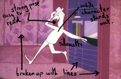
At the moment the white background contrasting with the wallpaper shape is the main focus in your image. You really want the audience to be looking at your characters faces, not the pretty wallpaper :) Currently the heads look particularly small because of the overwhelming size of the wallpaper shape (the sizing and composition works better in your pencil sketch). The warmer colour of the wallpaper comes forward over the cool colour of the characters skin, for a 3d feel its better to be the other way round. Using white can work well but with flat lighting it can look sterile and emotionless. Is this what you want?

Think about why you have chosen to use those colours. Is it to create a mood? are they contrasting (or not) for a reason? How can your regain focus on your characters? A quick way I can see to bring forward your character would be to use a simple shader for the skin with no pattern on the faces, and a lighter colour so that it stands out from a darker/or contrasting colour patterned background. As with Holly's project, paint over your render to see quickly what colours and lighting might work, try more than one version, and always look at the image as a whole and evaluate where your eye is being drawn to. I have done you a quick example (sorry its a bit messy), taking the blue 1950's image as reference as this is my personal favourite.


Lighting wise, I would suggest using a strong key light. Having a strong light direction should accentuate the facial features (flat lighting will do the opposite), and add to the tense atmosphere of the animation (since your narrative is about conflict, see the reference I put together to see this sort of lighting). Again the word contrast comes to mind. Can you think of a way of using shadows to show conflict? Perhaps your lighting could change as/if those emotions are resolved at the end. Maybe look to film noir for some lighting reference. Remember that your lighting doesn't have to be realistic, creating the right mood/atmosphere is more important.
Here are a few additional suggestions:
Think about projecting textures onto objects like the t-shirt and sofa, it makes for an interesting cut-out effect, remenissant of your 50's cartoons (and the bonnard painting in my reference....also see my painted example).
Blues and oranges work well together because they are opposites on the colour wheel (your reference images make use of this fact), as do reds and greens (beware of the christmassy look) and purple and yellows. Perhaps you could incorporate this idea?

Consider adding a few sharp edges or lines in your design. You are loosing the feel of the original reference because your image is very curvy.
Thats it for now. I hope some of this is useful. There is a lot to consider, I can't wait to see what you come up with.
Tessa
Hi Tessa
ReplyDeleteThanks so much for your detailed comments.
There certainly is a lot to consider so I'll do some tests this week to get things moving.
That sense of contrast was what I originally loved about my reference so I'm going to work to get that feeling back.
speak soon
and thanks again
Yoli
no problem, hope your finding the other posts useful too. Cheers
ReplyDeleteTessa