Its great to see some work in progress and I am really pleased that you are not using Final Gathering because its not the look you really want. You can have control without loosing any quality, not to mention the faster render times.
The lighting is coming along great. The muted tones of the characters and the shop work well. I have colour corrected your render to hopefully give you some ideas. I notice that a lot of student films tend to be quite dark. I think this is because students want to light everything so it is all visible, and yet have nothing too over the top. Instead of creating a mood it often just looks dark and lifeless. I took your image into photoshop, brought it up a few stops and I think you are not far off, which means that your levels overall are quite good. It is certainly much warmer, a feeling you said you wanted to convey.


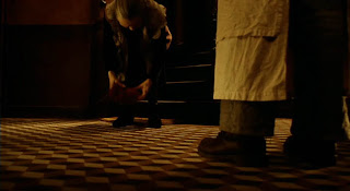
The floor works well, I like the pattern, and the red terra-cotta tiles (is the doubling up of pattern a mistake?). It adds to the strong perspective of the room, textures do not have to be distracting, look at some of the reference I put together for Yoli. You can use this texture to add interest and guide your eye to the characters. If you light your characters so that they stand out, the floor should not distract. I think it will be fine with the red sauce as long as you think about contrast, maybe bump up the saturation of the sauce and keep muted tones for everything else (you can do this easily in comp as an afterthought) If you decide you want to use the green floor, you still can, but I would make it more saturated. Look to films like 'Amelie', 'Delicatessen' and 'City of lost Children' ( Jeunet and Caro) to see how far you can go with reds and greens, and how you can use patterns and lighting in your shots to frame them. Here are some images to remind you.


Your characters look great, I don't think you will have a problem fitting them in. Think about making the skin tones stand out a little using sub surface scattering. Making them a little redder adds to the believability of the characters, and they will contrast better against a less saturated background.
The key light shadow shapes on the floor looking good although I think you should look at using some shadow blur on that sunlight, even better if you can get the shadow blur to fall off with distance. This will increase your render times but it is one of the few times I will say, it is worth it. Here are some pictures I took on that you can use as reference:

This website also has some great shadow images, you might want to read the comments about the meanings too.
http://www.pbase.com/pnd1/light&page=1
It is best to find out the source of the bright wall, trying to fix problems with more lights will probably backfire in the long run. Turn off all the lights, and do a render for each light so you can tell if there is a light accidentally lighting that wall. It could be dodgy shadow map that need adjusting, but it is most probably the bounce light. You said it was a directional/infinity light, that would be why it is lighting the back wall and not the wall on the left. If the wall is a separate piece of geo, you could 'light link' it so it is not affecting that wall, or you could re-consider your choice of light/or settings of the light. Personally I would go with the second option as I am not a big fan of light linking... it can get very confusing, but some people like it.
A note on negative lights, I haven't used these for years, before we had occlusion, when it was a method to fake contact occlusion under chairs. Come to think of it, I believe we used them to make a fake contact occlusion pass for massive crowds on 'Happy Feet' with one negative light per penguin as it would have been 'crazy'/impossible to use ray-tracing for that. I wouldn't recommend them unless you have no other option.
Most of your work can be done when you get to shot lighting. Start as soon as you have blocked animation, do quick renders and then paint over them to see if your lighting ideas are going to work, and build up a storyboard of shots with basic lighting. Its better to have a plan than make it up last minute. Make RGB mattes for the characters and feature objects in the room, so that you can grade them individually in comp. Most companies do a final grade on their films/adverts to tie it all together, and because clients like to sit on a sofa in a nice suite and feel that they have some control over the final images.
I think the textures overall are going in the right direction, although you should think about adding some displacements or bump on a few objects for example wood grain on work surfaces, to add fine detail for your lights to pick up. The wooden texture on the shelving (right of frame) needs some attention, its too big, and confuses the scale of things. If this is a conscious decision to add some character and stylization, then you would need to do this throughout, at the moment it just looks like an incorrectly scaled texture.

Also any objects you have with sharp edges like the shelves need a slight bevel (or a more obvious one if you cant see it) so that it picks up a little highlight along the edge, very few objects in the real world have sharp edges. On another note, when you know a rounded object is going to be in the foreground of the shot, make sure that you turn up the smoothing/smooth normals, for example the edam style cheese. My only other comment is about the beams, somehow I am not convinced by them. They don't look like they are supporting anything, maybe they need to be a bit chunkier? It would be nice to use and see them in a few shots if you have a low camera angle planned.
When you do get to shot lighting you might want to consider adding glows/atmospheric/fog in a few areas but only to enhance the feel of it being a dusty old atmospheric shop. The best advice I have for you now is to go and watch lots of good films, with strong colour casts, and think about the lighting/mood as your watching. Anything like the Godfather (I and II), Children of men, Citizen Cane, Gladiator, any pixar film... the list goes on and on. You will get lots of ideas.
Hope this is enough to keep you busy,
Tessa
No comments:
Post a Comment