I can't take credit for this post, as it is from my mate Nick. I am not really a big knowledge on Metal ray or GI lighting, but he is. He also suggested researching lighting baking for your particular software as there is no point calculating every frame. Another friend (Philip) also pointed out that using a gaussian filter will be more forgiving (and simulate the softer edges as in photographs) ... compared with the mitchell filter which will give you sharper edges (which can be CG looking). Hope you found my last comment, I am only posting a new post when I think it is relevant for everyone to read. Pass you over to Nick.
Cheers Nick...
Best interior GI lighting forum ive read (with a mental ray focus), I
think somewhere in the 153 pages some one has made a summery of the key
points.
http://forums.cgsociety.org/showthread.php?f=87&t=190232&highlight=maxwell
And a few tips for achticture shading in mental ray:
Overview of the ach shaders in mental ray:
http://download.autodesk.com/us/maya/2009help/mr/shaders/architectural/architectural.html
MIA overview (Mental Images Architectural shader)
http://download.autodesk.com/us/maya/2009help/mr/shaders/architectural/arch_mtl.html#What_is_the_%3Cdfn%3Emia_material%3C/dfn%3E_?
A good overview of sky/sun simulation and using light portals to get
good interiors (bottom bits particularly good):
http://download.autodesk.com/us/maya/2009help/mr/shaders/architectural/arch_sunsky.html
And a bit on tone mapping (basically linear stuff in mental ray,
interiors always look a bit to dark using GI unless you do a bit of
gamma correction)
http://download.autodesk.com/us/maya/2009help/mr/shaders/architectural/arch_camera.html
And while I'm at it, good tute on lighting interiors (just theory):
http://www.itchy-animation.co.uk/tutorials/light04.htm
Get him to read ALL of this before he continues :)
Nick
Thursday, July 9, 2009
Tuesday, July 7, 2009
NIGEL GORE - Architectural Visualisation
Hi Tessa,
Thank you for all of your advice...
My render times have been greatly increased since I changed a few of the rendering parameters.
I am rendering out at 1280 x 584.
Some frames are taking up to 3 hours now.
I am currently using the Mitchell filter size '4'. The Alising is set to min 2 / max 4.
Before this, I was not able to achieve smooth diagonal lines (even with bevelling).
I am using one main spotlight that is emitting 80,000 photons. G.I. accuracy is set to 500.
Raytracing depth is set to 6 for reflection & refraction - due to there being a max of 3 overlaying glass areas.
Saf is currently looking into the possibility of us having access to a farm.
I was planning on creating just one version of the scene - demonstrating the contrast between the daylight & interior lights - by way of animating the interior lights intensity across the length of the piece. I would try to have a completely different light set up the kitchen area:

I know what you mean about not panning the camera both ways. However, The initial frame is what will be seen by anyone entering the house through the front door. Therefore, the animatic demonstrates the maximum panoramic view from this point and then again from further forward in the room. I have reworked the animatic and reduced it by 250 frames.
The 'still' section of the original animatic was where I intended to animate the interior lights to create different moods. However, I figure that this can still be done whilst the camera is moving.
The reason for animating the door open is to show the change and contrast of light & reflections entering the room. Plus I've achieved a nice effect where the two panes of glass layer each other:

I like what you've done with the manipulation of my image. This is one area that I need some advice on. Originally, I was trying to create a 'photo-realistic' scene. With a huge contrast between the brightness outside and the unlit interior. However, as you stated, this doesn't serve to produce the most inviting images...
I am now thinking that maybe I should begin with a 'dark' interior and make the scene come to life with creative interior lighting?
Therefore, the light change across the scene will be similar to what is demonstrated in the last two images in your earlier post.
What would you suggest?
Cheers,
Nigel
RE:NIGEL GORE - Architectural Visualisation
Hi Nigel,
Is that an infinity pool! I wouldn't mind living there :) I do have a few questions though first so this is going to be a relatively small post (compared with everyone else's first post), and I'll post again when you give me a little more info.
You say your in the production phase, what sort of length render times are you getting? Have you done any optimisation ? What settings are you using (for global illumination for example)? You are probably doing lots of raytracing (is it all necessary), reducing that work will reduce your render times. Do you have access to a farm?
Because your only real animation is the camera, you should be able to bake all of your lighting out into textures. Theoretically... this will dramatically reduce your render times as you will not need to do any lighting/raytracing on the fly (Unfortunately if your intending on using raytraced reflections and have lots of reflective objects that will increase your render times). Doing the bake may take some time, as you have a lot of objects in your scene, but it will be worth it in the savings you will make. If you have not thought of doing this I can explain more in the next post.
Consider only doing two versions (you are giving yourself more work, its better to do less, but do it well, than trying to do too much and not finishing in time), daylight and night time perhaps, unless you want to do a sunset/magic hour version? Were you planning on rendering the whole thing three times? or blending between the versions in comp? That way you would only have to render 10-15 seconds of each, and it would give a nice effect...
I can see a few ways you can cut your camera animation short to improve the flow of movement. Panning the camera one way, and then the other (imagine shaking your head to say 'no') stops the flow, it would look more fluid if you started at '8 seconds' (on your animatic) where the camera pans right to left and then heads forward into the room. Also you could try moving forward and rotating slowly, to get to where you want to be. The door opening is a nice effect, but it feels a little like your teasing the audience! Do you have a reason for opening it?
You have made a good start on the lighting. I have found some reference online which is what I imagine you want to achieve in your final render, but I would also look architectural photography for some ideas. Most CG images you see have some post work done on them so don't be afraid to run your renders through a comp workflow to get those last minute glows and final touches.


Your colour pass looks like it has occlusion multiplying it already, its better to multiply this in comp and take it out of your main render, that way you will have more control. If you look at the reference, the occlusion is very subtle, and you can only see it in areas where little or no bounce is getting there. What you want to see is an overall lighter picture, with the sun really reaching into the room, bouncing and glowing everywhere. To sell this house you want to create a sunny bright atmosphere, at the moment its a bit dark and not so inviting. I have done a little painting and colour correction on your image, to show you what I mean.


Something you said reminded me of a section I read in the Advanced renderman companion. The emphasis of your project is on realistic images. In films, skin tones are lit and colour corrected to make the skin tones look "rosy". This is because people remember skin tones as being warmer and pinker than they really are (researchers who study human response to colour have established this fact). Realistic coloured skin tones tend to give an image a documentary feel.
My advice/conclusion: Play with realism a bit. Make the audience feel the sunlight, not just see it.
Looking forward to your response, lets see if we can get those render times down.
Tessa
Monday, July 6, 2009
NIGEL GORE - Architectural Visualisation
Hi Tessa,
I've just published a post which unfortunately appears a few pages back:
June 29th (when I first saved a draft copy)
Can you please have a look at it and get back to me.
Cheers,
Nigel Gore MA3D
I've just published a post which unfortunately appears a few pages back:
June 29th (when I first saved a draft copy)
Can you please have a look at it and get back to me.
Cheers,
Nigel Gore MA3D
Sunday, July 5, 2009
Re:Yoli's Project
Hi Yoli,
I really like your idea and your pencil sketch has a nice illustrative feel to it, its well composed, and has a hint of what you want to do with lighting. It is particularly tricky to convert a 2d art-form into a 3d one keeping the original essence, making this project quite ambitious, hopefully I can give you some ideas on how to achieve this.
First of all I would advise you to look to other sources of inspiration as well as your 1950's cartoons. Photography, art of the era, art of the past and other short animations [www.pearcesisters.co.uk]. See how they successfully use patterns and lighting. I have made you up a montage to start you with some ideas. Your project is a bit of an unknown, your 2d reference has no 'lighting' in it... I find looking at a variation of images can really give inspiration when your not really sure what you want it to look like.

Your 1950's reference is a display of contrast in every sense. Contrast between colours, beween pointy sharp shapes and curvey shapes, between patterened and non patterned surfaces. Notice how contrast is used to empahsise the action/character. I appreciate that your render is still in the work in progress stage, I can see that you have tried to stay true to your reference by taking some of the ideas such as the white background, and the use of patterns. For me, your pencil drawing works better than your current 3d version because even though there is no colour or texture, you have contrast in the line and shading qualities, ie having a flat background with curves and more detail on your character, with some sharp edges.

On another note: Be careful not to lose your characters expressions, keep looking back to your reference. Notice how often the characters are placed so that you see a silhouette of the action, ie the mouth shape, or the nose sticks out, the eyes use incorrect angles (much the same as picasso was doing) to ecentuate the key poses for the animation. Your reference characters are mostly a plain colour with outlines and use line to show expressions, unless you choose to go down a 'toon shader' route, you will have to use lighting instead of line to get the same results.
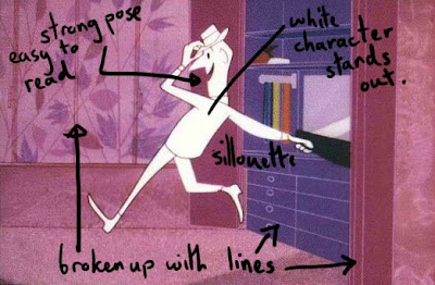
At the moment the white background contrasting with the wallpaper shape is the main focus in your image. You really want the audience to be looking at your characters faces, not the pretty wallpaper :) Currently the heads look particularly small because of the overwhelming size of the wallpaper shape (the sizing and composition works better in your pencil sketch). The warmer colour of the wallpaper comes forward over the cool colour of the characters skin, for a 3d feel its better to be the other way round. Using white can work well but with flat lighting it can look sterile and emotionless. Is this what you want?

Think about why you have chosen to use those colours. Is it to create a mood? are they contrasting (or not) for a reason? How can your regain focus on your characters? A quick way I can see to bring forward your character would be to use a simple shader for the skin with no pattern on the faces, and a lighter colour so that it stands out from a darker/or contrasting colour patterned background. As with Holly's project, paint over your render to see quickly what colours and lighting might work, try more than one version, and always look at the image as a whole and evaluate where your eye is being drawn to. I have done you a quick example (sorry its a bit messy), taking the blue 1950's image as reference as this is my personal favourite.


Lighting wise, I would suggest using a strong key light. Having a strong light direction should accentuate the facial features (flat lighting will do the opposite), and add to the tense atmosphere of the animation (since your narrative is about conflict, see the reference I put together to see this sort of lighting). Again the word contrast comes to mind. Can you think of a way of using shadows to show conflict? Perhaps your lighting could change as/if those emotions are resolved at the end. Maybe look to film noir for some lighting reference. Remember that your lighting doesn't have to be realistic, creating the right mood/atmosphere is more important.
Here are a few additional suggestions:
Think about projecting textures onto objects like the t-shirt and sofa, it makes for an interesting cut-out effect, remenissant of your 50's cartoons (and the bonnard painting in my reference....also see my painted example).
Blues and oranges work well together because they are opposites on the colour wheel (your reference images make use of this fact), as do reds and greens (beware of the christmassy look) and purple and yellows. Perhaps you could incorporate this idea?

Consider adding a few sharp edges or lines in your design. You are loosing the feel of the original reference because your image is very curvy.
Thats it for now. I hope some of this is useful. There is a lot to consider, I can't wait to see what you come up with.
Tessa
Thursday, July 2, 2009
homework
for anyone who is interested... a bit of bed time reading :)
Get hold of a copy of the 'Advanced Rendeman' book and read chaper 13, 'Storytelling through Lighting, a Computer Graphics Perspective'
its designed as a nontechnical discussion about lighting, everyone can learn from this chapter.
borrow, steal, beg or buy it if you have the money and think you might end up on the rendering side of the film industry...
Tessa
short break
Keep posting. I have got a bit busy with work the last few days so I'll try to catch up at the weekend. I haven't forgotten you Yoli.
Subscribe to:
Posts (Atom)