Hi Tessa,
Thanks for the mammoth response :)
I'll take your advice on board and let you know how I get on.
Cheers for you comments,
Jamie.
Tuesday, July 21, 2009

RE: Jamie's Project Update
Hi Jamie
Apologies for the delay, it's taken me a bit of time to get around to answering.
Thanks for your comments, so far I have really enjoyed following everyone's progress on this blog and I have been watching you guys on the modeling blog as well. Hopefully I can match your mammoth post with an equally mammoth amount of feedback :)
Its good to do some experimenting in 2d this early in production, it should give you confidence and understanding of what you can achieve in the time you have left. Rendering passes is always going to give you more control, so keep going with this technique. Using a matte-painting for you background should set off your model nicely, I don't think you will have too much of a problem integrating it in post. The most important thing now is that you have an artistic goal, and then you can tailor your work/layers to achieve it. I do have a few comments about your first experiments, (I completely understand that it is work in progress) hopefully it will give you some ideas on what to do next.
Your reference is taken from epic and dramatic films, and I can see you have taken elements to try and get a similar mood. It is a little unfortunate that all of your reference shots are close ups, you could do with finding some wider shots so that you can really see the shadows. I have been looking at 'Gladiator' for some reference, although you can just go outside and look at some real shadows :)


If you observe the outside world, you will find that when the sun (or moon) shines, those soft shadows under objects become less obvious, or completely disappear. Then as the clouds come over, the light becomes hazy, the shadows become blurred and disappear within cloud shadows, this is when you see ambient occlusion, although often it is still quite subtle. The human eye is very perceptive at spotting when something doesn't look right. Using both soft shadows and sharp shadows equally (adding them together as you have tried in your last post) is never going to look like a 'realistic' outdoor lit scene. Try rendering out a shadow pass of the ground, confining occlusion to within the shadow, should help with the believability.
Final Gathering normally works as a one pass global illumination simulation. It bounces around light, (diffuse reflections) so you are not getting an accurate result if you do not include the key shadow casting light. Final Gathering works best in interior lighting because this is where you would most see bounced light, off walls and furniture. As I said before, I don't really know much about FG, but I think if you want it to work in this situation, as a global illumination tool, you should probably look at changing your settings to get a more accurate outdoor feel. Also because you are colour correcting and adding on extra lights in comp you are not really seeing the work the light probe has done. It's something to think about.
On another similar note, I would not use both FG and ambient occlusion. In CG to get realistic results we need occlusion to take out some of the wrongly placed light from the fill, such as light inside characters mouths, and the contact shadow between the foot and the floor. If your fill already has soft shadows then really your just doubling up the effect. The occlusion pass makes everything look pretty... but it is a good idea to play with the levels in comp to get the desired look before you multiply it by the rest of the lighting. Often occlusion is very subtle, and its the icing on the CG cake... not the cake itself. Keep looking at your reference.


You talk about the Final Gathering render as soft, with a bright outdoor feel. On its own, to me it looks like a daytime that is dull and overcast in comparison to a bright sunny day. Overcast lighting in an action scene tends to look like a documentary. In war films it is used to show the harsh reality of battle. In 'The Incredibles' overcast lighting is used in the scene to accentuate how bored Mr Incredible is with his mundane life, and the dull colours are used in contrast to the rest of the film which is altogether more exciting. On the other hand using a strong light source, to show dramatic daytime lighting, is effective in war films where the goal is to glorify battle. As if the sun is shining down from a higher power.. I would say trying to mix the two is a bit of a contradiction. Personally, I would make more of your dramatic key light, currently it is a bit feeble as a rim light. For example you might want to try more than one key light (although only one shadow casting, or re-use the same shadow for both lights) to trick/spill the light around so that it catches more of both characters. It shows off the shape of your model, and instantly looks more epic.

Be careful using 2d depth of field. Z depth passes are not normally edge aliased, I know some people use fog instead, or a z depth shader so they get aliased edges. Another option is to render it double size and shrink it down. Make sure that you output the pass at a minimum of 16 bit to get all that info. You are getting glows around your model because of the inaccuracies (are you blurring the z depth pass as well?) The easy solution is to render the model out on a separate pass from the ground, so that you can blur them separately, this is what I would do.
Also using a shallow depth of field is making your model look the wrong scale, almost miniature. I found this interesting:
http://en.wikipedia.org/wiki/Tilt-shift_miniature_faking
We generally see landscapes shot with a wide angle lens. Even though the depth of field is the same as with a telephoto lens the effect is very different because of the perspective of the background, the blur is perceived to be less although in fact the perspective makes it look further away. Its fascinating stuff....http://www.luminous-landscape.com/tutorials/dof2.shtml
If you want to keep the shallow depth of field for your final images, I would look at changing your lens, and/or camera position/angle.
One final note, keep experimenting with colour, all of your reference has a warm/exotic feel to it, which invokes feelings of nostalgia. Unfortunately your battle took place in a much cooler climate, so you might want to think about how you can incorporate that and still keep the mood you are looking for.
If you have any questions, don't hesitate to ask. Great to see some progress, its looking good!
Cheers
Tessa
Monday, July 20, 2009
NIGEL GORE - Architectural Visualisation
Hi Tessa,
Thank you for your feedback...
I've spent the last week or so experimenting with rendering options and also the interior lighting.
The long rendering times appear to be solely due to the raytracing on the large glass areas of the patio windows. Once they are disabled, the render time drops dramatically - Even with FG /GI on.
I'm now looking into rendering out the glass reflections as a seperate pass. Do you think that this pass will take just as long to render as when it was combined to the rest of the scene?
I hadn't baked any of my textures yet because I was still testing but this is probably my next step.
Meanwhile, I've come across another lighting problem... The 'glow' of the interior spotlights.
Within xsi the glow function only seems to render if a large surface area of the 'glowing' object is visible to the camera. Therefore, it has not been possible for me to achieve the type of look I'm going for. Also, once the glow was added, the main spotlight lights only rendered out occasionally - even though they were 'on' all the time. After spending a couple of frustrating days trying to get better reults, I'm now thinking that adding this in 'post' might be the best way to proceed with the glowing effect. What would you suggest.
Before: All spotlights working
 During: Glowing objects - not glowing in places - Spotlights temperamental

After: Spotlights & glows never work well in conjuntion with each other

Look forward to your response.
Cheers,
Nigel
Thank you for your feedback...
I've spent the last week or so experimenting with rendering options and also the interior lighting.
The long rendering times appear to be solely due to the raytracing on the large glass areas of the patio windows. Once they are disabled, the render time drops dramatically - Even with FG /GI on.
I'm now looking into rendering out the glass reflections as a seperate pass. Do you think that this pass will take just as long to render as when it was combined to the rest of the scene?
I hadn't baked any of my textures yet because I was still testing but this is probably my next step.
Meanwhile, I've come across another lighting problem... The 'glow' of the interior spotlights.
Within xsi the glow function only seems to render if a large surface area of the 'glowing' object is visible to the camera. Therefore, it has not been possible for me to achieve the type of look I'm going for. Also, once the glow was added, the main spotlight lights only rendered out occasionally - even though they were 'on' all the time. After spending a couple of frustrating days trying to get better reults, I'm now thinking that adding this in 'post' might be the best way to proceed with the glowing effect. What would you suggest.
Before: All spotlights working
 During: Glowing objects - not glowing in places - Spotlights temperamental
After: Spotlights & glows never work well in conjuntion with each other

Look forward to your response.
Cheers,
Nigel
Thursday, July 16, 2009
Jamie's Progress Update
Hi Tessa,
I've been doing some testing over the last day or 2 and thought I would let you know how things are going. I've been following the blog as I work, your doing a wonderful job!, great to read your advice to others.
So... If you remember my horseback fighting modelling project from my earlier post....
I realised there wasn't much point going about lighting my scene without something to aim for so I have been trying to find references with an epic, dramatic mood and have gatherred some images with that feeling and the sort of colours I will be using. The following images are from the Return of the King, Beowulf, Gladiator and Hellboy 2.

After my fist post you asked what I was going to do for the environment, and I must admit I was so busy trying to model the poses I hadn't really considered it fully. In the images above, particularly the ones on the left side the background is slightly ambiguous with atmospheric dust and the sky and landscape quite blurred out and suggestive. This is what I'm going to try to do with the environment. I was at the battlefield at the weekend and gathered lots of material to help produce painted planes that will hopefully fill out the distant landscape in my scene.
Below is my first compositing trial, graded to match the lord of the rings colours from above. It was rendered using final gather and the light probe images I took on the Bannockburn battlefield. It also has a ambient occlusion pass multiplied in and I rendered a Zdepth pass and used this to add blur. I also added on top a render with a single directional light to pick out some areas of the horse.

Because I hadn't setup the background mattes yet I did a photoshop paintover to suggest what I would like to end up with, bearing in mind the texture work is only just begining really and there are alot of elements not yet included:

I like the way it is looking, even though the background is just a few brush strokes on the horizon if I could recteate this kind of feel I'd be happy, I worry it might all be a bit more uniform and CG looking once I create it, but I'll try to avoid that.
One last thing that I'm trying out is shown below, I did a quick 3 point lighting setup in XSI and added it in nuke to the final gather render I had done using the light probe images. The result gives the long shadows and stronger light source of the 3 point render whilst retaining the softness and bright outdoor feel from the FG render. I like the idea of using this method, it's like you said in an earlier post, like using the environment light as a fill light, just to lift the whole thing. I will experiment more with this and try to encorporate the textures, the background and all other scene elements but as it stands I think I will go for this kind of technique.

I suppose it's more heavilly relying on compositing with no single final render outputted from XSI, but I quite like the control you get from it. Maybe you could let me know your thoughts on this way of working.
Sorry for the mamoth post, hope I explained my process well enough.
Look forward to hearing any thoughts you might have.
Jamie.
I've been doing some testing over the last day or 2 and thought I would let you know how things are going. I've been following the blog as I work, your doing a wonderful job!, great to read your advice to others.
So... If you remember my horseback fighting modelling project from my earlier post....
I realised there wasn't much point going about lighting my scene without something to aim for so I have been trying to find references with an epic, dramatic mood and have gatherred some images with that feeling and the sort of colours I will be using. The following images are from the Return of the King, Beowulf, Gladiator and Hellboy 2.

After my fist post you asked what I was going to do for the environment, and I must admit I was so busy trying to model the poses I hadn't really considered it fully. In the images above, particularly the ones on the left side the background is slightly ambiguous with atmospheric dust and the sky and landscape quite blurred out and suggestive. This is what I'm going to try to do with the environment. I was at the battlefield at the weekend and gathered lots of material to help produce painted planes that will hopefully fill out the distant landscape in my scene.
Below is my first compositing trial, graded to match the lord of the rings colours from above. It was rendered using final gather and the light probe images I took on the Bannockburn battlefield. It also has a ambient occlusion pass multiplied in and I rendered a Zdepth pass and used this to add blur. I also added on top a render with a single directional light to pick out some areas of the horse.

Because I hadn't setup the background mattes yet I did a photoshop paintover to suggest what I would like to end up with, bearing in mind the texture work is only just begining really and there are alot of elements not yet included:

I like the way it is looking, even though the background is just a few brush strokes on the horizon if I could recteate this kind of feel I'd be happy, I worry it might all be a bit more uniform and CG looking once I create it, but I'll try to avoid that.
One last thing that I'm trying out is shown below, I did a quick 3 point lighting setup in XSI and added it in nuke to the final gather render I had done using the light probe images. The result gives the long shadows and stronger light source of the 3 point render whilst retaining the softness and bright outdoor feel from the FG render. I like the idea of using this method, it's like you said in an earlier post, like using the environment light as a fill light, just to lift the whole thing. I will experiment more with this and try to encorporate the textures, the background and all other scene elements but as it stands I think I will go for this kind of technique.

I suppose it's more heavilly relying on compositing with no single final render outputted from XSI, but I quite like the control you get from it. Maybe you could let me know your thoughts on this way of working.
Sorry for the mamoth post, hope I explained my process well enough.
Look forward to hearing any thoughts you might have.
Jamie.
Monday, July 13, 2009
RE: Deli Team update
Hi Gareth
Its great to see some work in progress and I am really pleased that you are not using Final Gathering because its not the look you really want. You can have control without loosing any quality, not to mention the faster render times.
The lighting is coming along great. The muted tones of the characters and the shop work well. I have colour corrected your render to hopefully give you some ideas. I notice that a lot of student films tend to be quite dark. I think this is because students want to light everything so it is all visible, and yet have nothing too over the top. Instead of creating a mood it often just looks dark and lifeless. I took your image into photoshop, brought it up a few stops and I think you are not far off, which means that your levels overall are quite good. It is certainly much warmer, a feeling you said you wanted to convey.


The floor works well, I like the pattern, and the red terra-cotta tiles (is the doubling up of pattern a mistake?). It adds to the strong perspective of the room, textures do not have to be distracting, look at some of the reference I put together for Yoli. You can use this texture to add interest and guide your eye to the characters. If you light your characters so that they stand out, the floor should not distract. I think it will be fine with the red sauce as long as you think about contrast, maybe bump up the saturation of the sauce and keep muted tones for everything else (you can do this easily in comp as an afterthought) If you decide you want to use the green floor, you still can, but I would make it more saturated. Look to films like 'Amelie', 'Delicatessen' and 'City of lost Children' ( Jeunet and Caro) to see how far you can go with reds and greens, and how you can use patterns and lighting in your shots to frame them. Here are some images to remind you.

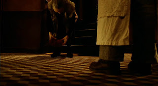


Your characters look great, I don't think you will have a problem fitting them in. Think about making the skin tones stand out a little using sub surface scattering. Making them a little redder adds to the believability of the characters, and they will contrast better against a less saturated background.
The key light shadow shapes on the floor looking good although I think you should look at using some shadow blur on that sunlight, even better if you can get the shadow blur to fall off with distance. This will increase your render times but it is one of the few times I will say, it is worth it. Here are some pictures I took on that you can use as reference:

This website also has some great shadow images, you might want to read the comments about the meanings too.
http://www.pbase.com/pnd1/light&page=1
It is best to find out the source of the bright wall, trying to fix problems with more lights will probably backfire in the long run. Turn off all the lights, and do a render for each light so you can tell if there is a light accidentally lighting that wall. It could be dodgy shadow map that need adjusting, but it is most probably the bounce light. You said it was a directional/infinity light, that would be why it is lighting the back wall and not the wall on the left. If the wall is a separate piece of geo, you could 'light link' it so it is not affecting that wall, or you could re-consider your choice of light/or settings of the light. Personally I would go with the second option as I am not a big fan of light linking... it can get very confusing, but some people like it.
A note on negative lights, I haven't used these for years, before we had occlusion, when it was a method to fake contact occlusion under chairs. Come to think of it, I believe we used them to make a fake contact occlusion pass for massive crowds on 'Happy Feet' with one negative light per penguin as it would have been 'crazy'/impossible to use ray-tracing for that. I wouldn't recommend them unless you have no other option.
Most of your work can be done when you get to shot lighting. Start as soon as you have blocked animation, do quick renders and then paint over them to see if your lighting ideas are going to work, and build up a storyboard of shots with basic lighting. Its better to have a plan than make it up last minute. Make RGB mattes for the characters and feature objects in the room, so that you can grade them individually in comp. Most companies do a final grade on their films/adverts to tie it all together, and because clients like to sit on a sofa in a nice suite and feel that they have some control over the final images.
I think the textures overall are going in the right direction, although you should think about adding some displacements or bump on a few objects for example wood grain on work surfaces, to add fine detail for your lights to pick up. The wooden texture on the shelving (right of frame) needs some attention, its too big, and confuses the scale of things. If this is a conscious decision to add some character and stylization, then you would need to do this throughout, at the moment it just looks like an incorrectly scaled texture.

Also any objects you have with sharp edges like the shelves need a slight bevel (or a more obvious one if you cant see it) so that it picks up a little highlight along the edge, very few objects in the real world have sharp edges. On another note, when you know a rounded object is going to be in the foreground of the shot, make sure that you turn up the smoothing/smooth normals, for example the edam style cheese. My only other comment is about the beams, somehow I am not convinced by them. They don't look like they are supporting anything, maybe they need to be a bit chunkier? It would be nice to use and see them in a few shots if you have a low camera angle planned.
When you do get to shot lighting you might want to consider adding glows/atmospheric/fog in a few areas but only to enhance the feel of it being a dusty old atmospheric shop. The best advice I have for you now is to go and watch lots of good films, with strong colour casts, and think about the lighting/mood as your watching. Anything like the Godfather (I and II), Children of men, Citizen Cane, Gladiator, any pixar film... the list goes on and on. You will get lots of ideas.
Hope this is enough to keep you busy,
Tessa
Saturday, July 11, 2009
Deli Team Update
Hi Tessa,
I thought I would post an update regarding the current progress of the project. The lighting stage of this project is yet to begin - however within these test renders you will see we've set up a basic light rig to simply view the shop thus far. The rig consists of a sun source (infinite light) a basic bounce light (infinite light) and 3 point lights to illuminate the areas nearest to the windows.

Thanks for the advice regarding the FG - as you can see here I've simply rendered out two passes for now - a beauty pass and an AO pass and I think they look reasonably good so far. As you have suggested we do plan to render out a number of passes and fully composite the whole thing for greater control.


At first we were worried that having a particularly red shop would make the sauce splatters less noticable within the scene and so i rendered out a pass with the floor green, however, personally I think the red floor works better giving the whole scene a warmer feel - something we wish to convey. As you may also notice within the renders the far wall appears to be significantly brighter than it should be and I'm not totally sure why this is - however would using an inclusive negative light be sufficient to simply 'take-out' light from the wall? Or should I address the issue more directly i.e. work out why this is happening?
Also within the 'red' render I've put two of our characters in to see how well they fit - what do you think?
I've also been advised that using textures such as the one on the floor may be a little too distracting within the film - what do you think? Should I simplify it to something more plain?
Any advice on the aesthetic would be appreciated - texturing, lighting or colour....
Thanks for your time, it's greatly appreciated.
Gareth
I thought I would post an update regarding the current progress of the project. The lighting stage of this project is yet to begin - however within these test renders you will see we've set up a basic light rig to simply view the shop thus far. The rig consists of a sun source (infinite light) a basic bounce light (infinite light) and 3 point lights to illuminate the areas nearest to the windows.

Thanks for the advice regarding the FG - as you can see here I've simply rendered out two passes for now - a beauty pass and an AO pass and I think they look reasonably good so far. As you have suggested we do plan to render out a number of passes and fully composite the whole thing for greater control.


At first we were worried that having a particularly red shop would make the sauce splatters less noticable within the scene and so i rendered out a pass with the floor green, however, personally I think the red floor works better giving the whole scene a warmer feel - something we wish to convey. As you may also notice within the renders the far wall appears to be significantly brighter than it should be and I'm not totally sure why this is - however would using an inclusive negative light be sufficient to simply 'take-out' light from the wall? Or should I address the issue more directly i.e. work out why this is happening?
Also within the 'red' render I've put two of our characters in to see how well they fit - what do you think?
I've also been advised that using textures such as the one on the floor may be a little too distracting within the film - what do you think? Should I simplify it to something more plain?
Any advice on the aesthetic would be appreciated - texturing, lighting or colour....
Thanks for your time, it's greatly appreciated.
Gareth
Thursday, July 9, 2009
FOR EYERYONE: This really is a great tutorial on light
just to re-iterate from the last post...
Lots of great explanations... I couldn't do it any better.
He does 'dis' the 3 point light setup a little,
(but I think it is the best/simplest way to start CG lighting)
Otherwise this is a great tutorial, read all four sections.
Tessa
Subscribe to:
Posts (Atom)